
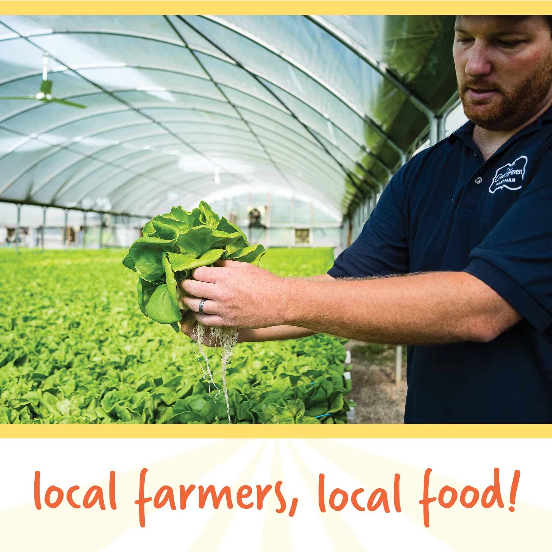
As Sandhills Farm to Table was preparing for the upcoming season, they were ready for a brand refresh. When meeting, words like “bright,” “friendly,” and “fresh” were repeated.
They wanted their mission front and center—local farmers, local food. Simplicity was key.
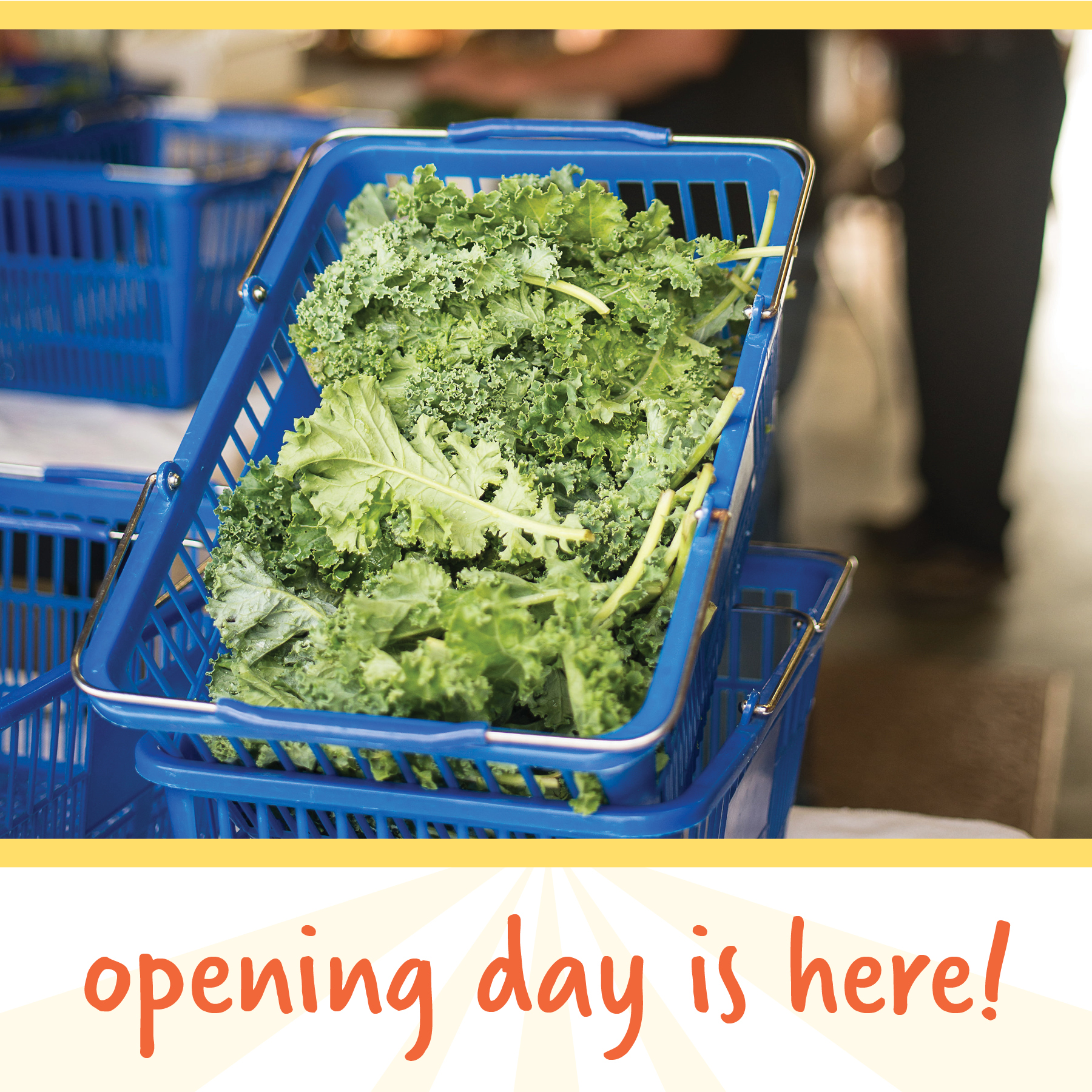
I chose a handwritten typeface reminiscent of a farm stand. The color palette was selected from something at the core of their brand: fruits and vegetables. Using photos of their farmers and produce, we created an authentic poster, advertisement, rack card, and social media campaign.
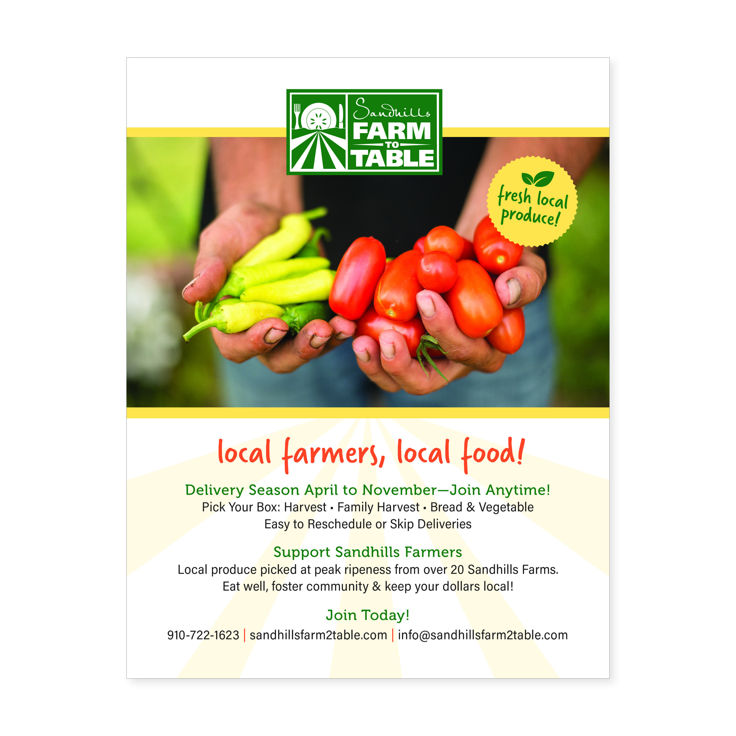
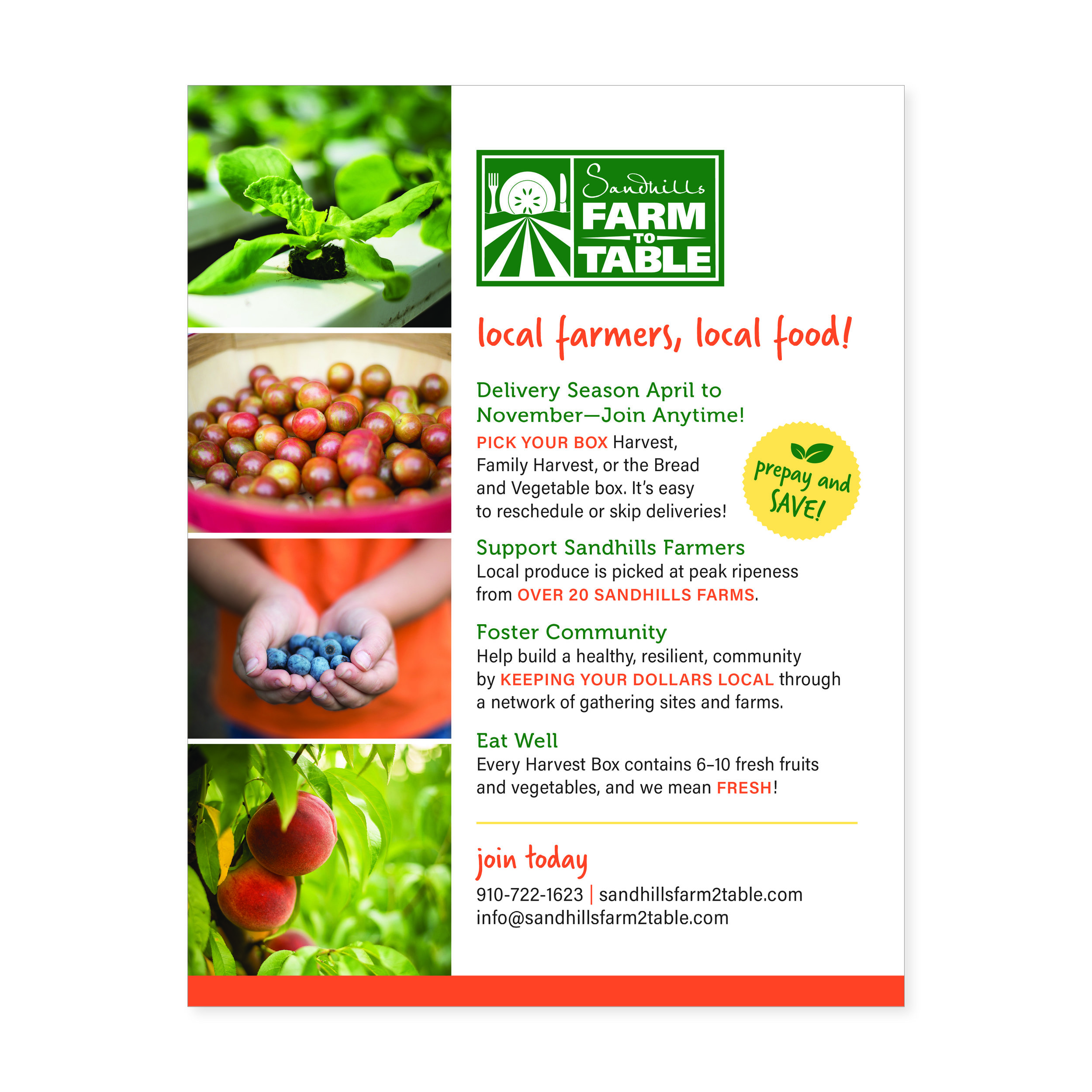
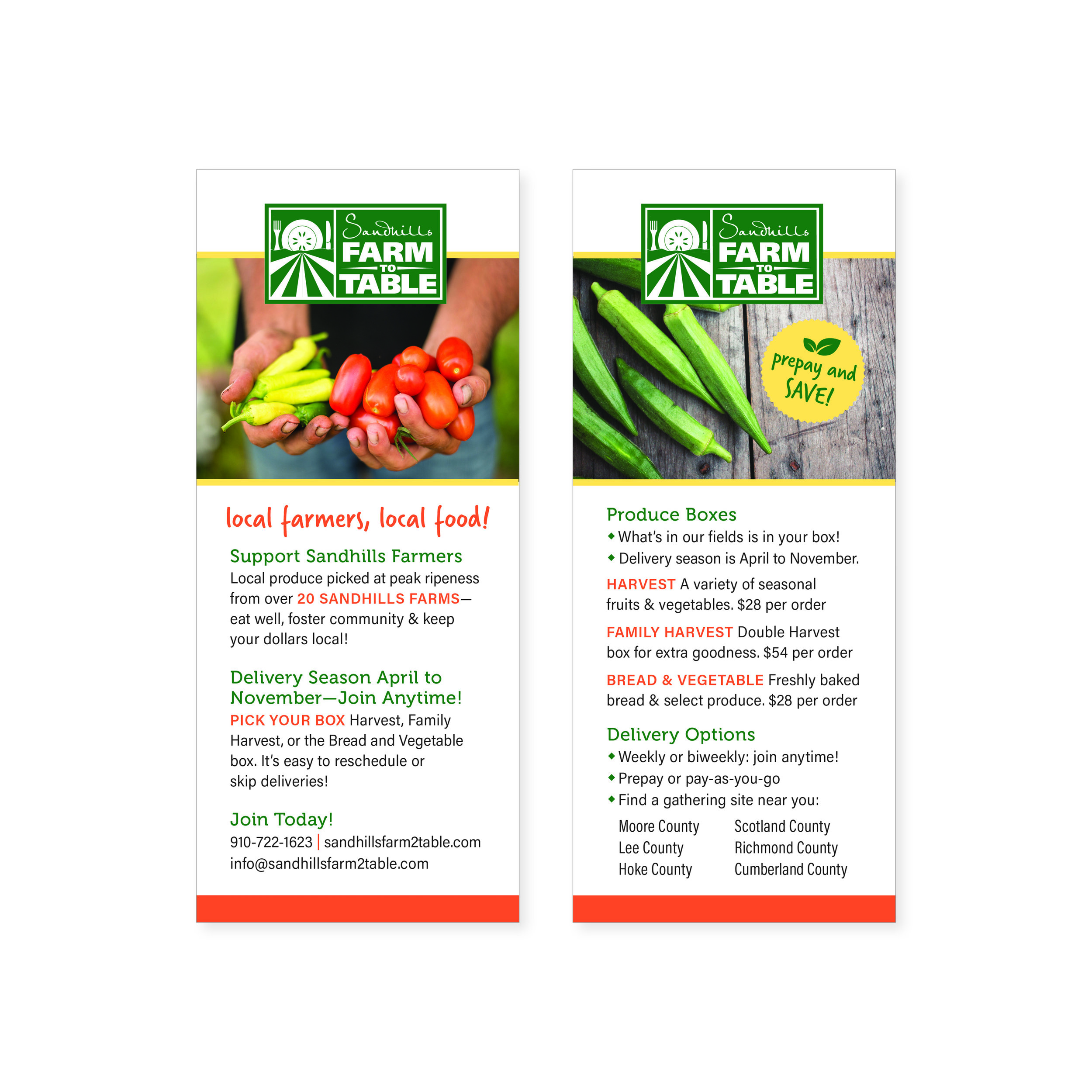
Poster / Flier / Rack Card
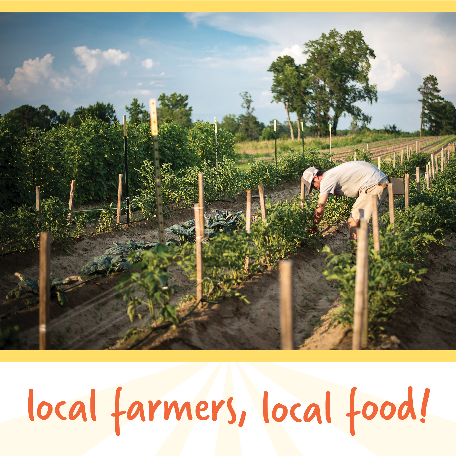
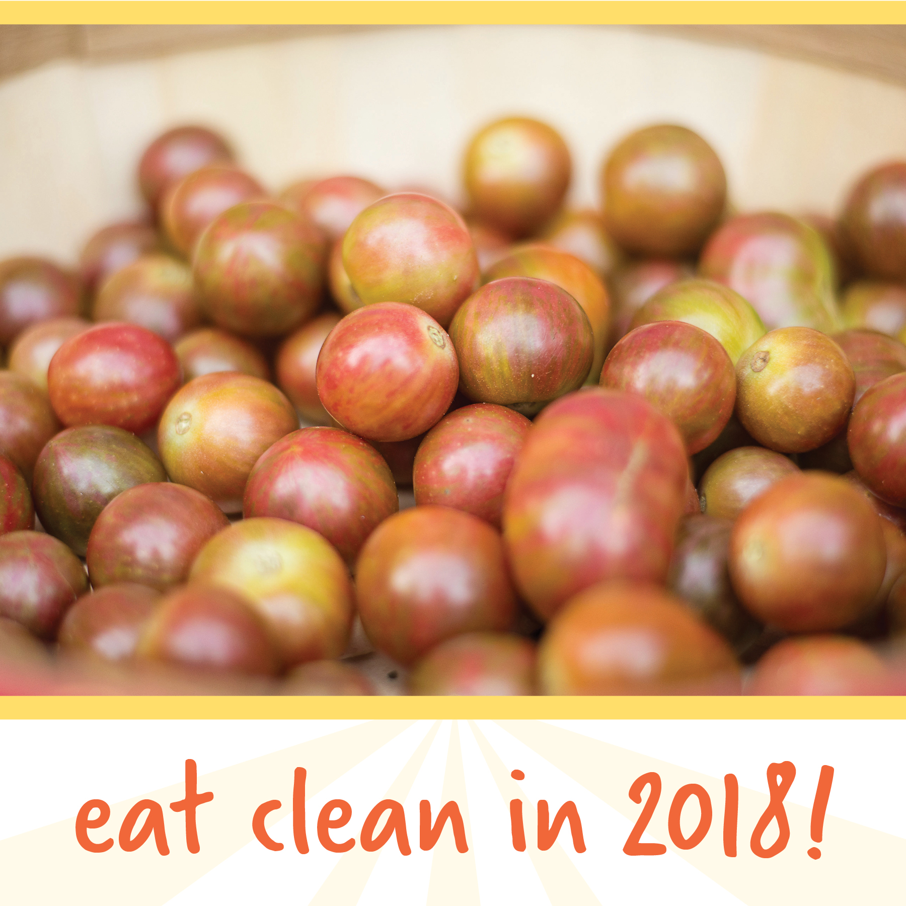

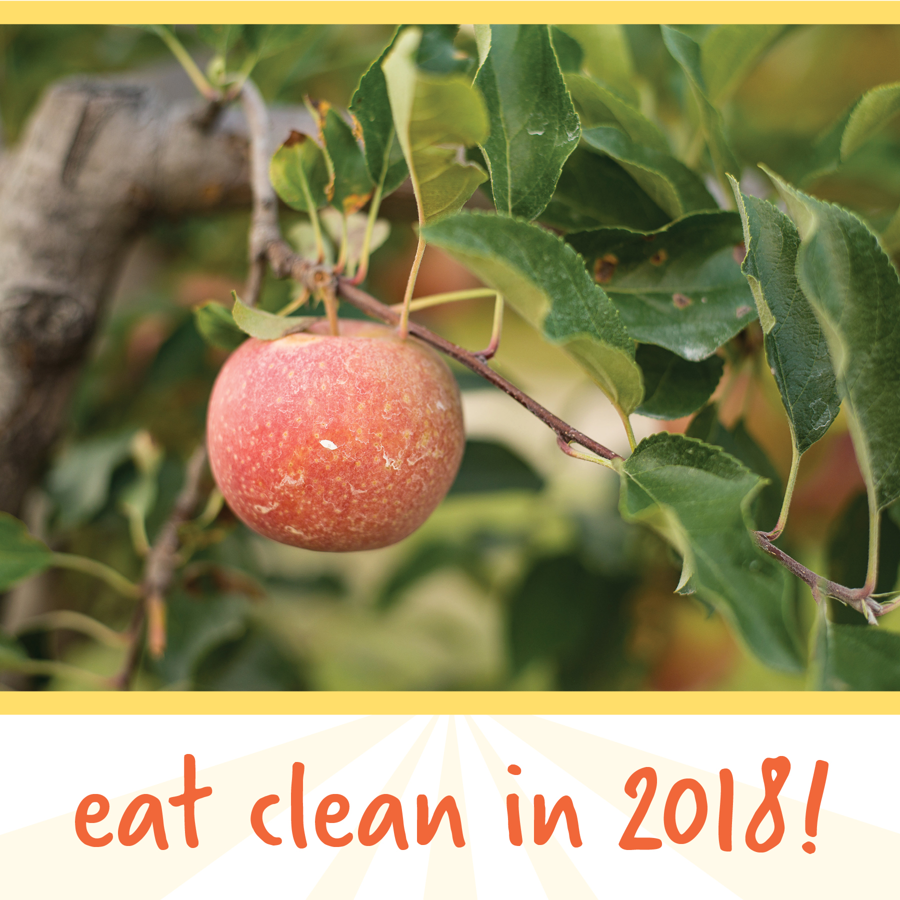
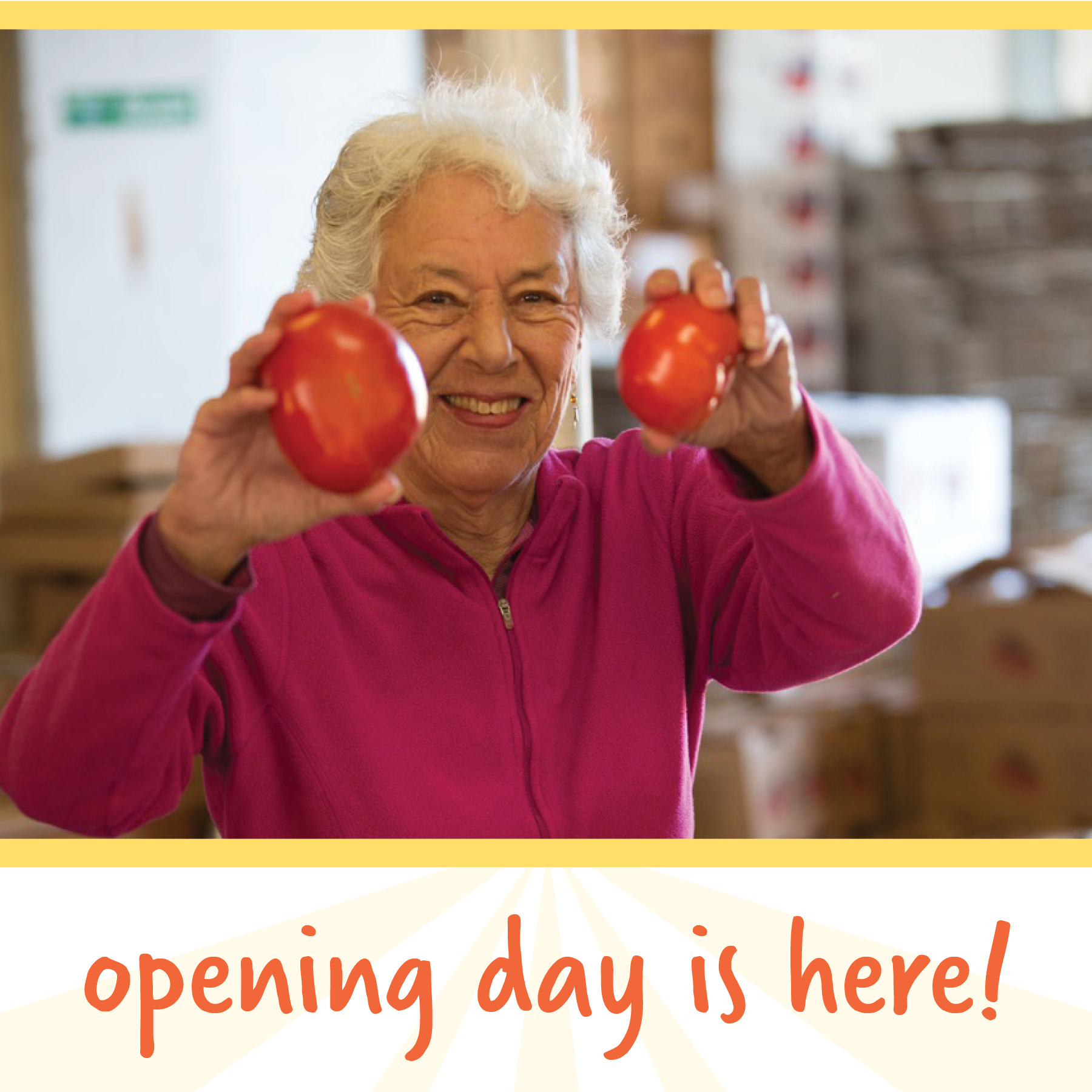
Social Media Imagery

Color Palette
Original Poster Design