Rolling Green Cattle Company

Rolling Green Cattle Company asked for a logo with a quality, vintage, (possibly cowboy) feel— created for people who care about their food, and where their food comes from. The client described the picturesque rolling fields that the cattle live on, and the feel-good, sunshiny vibe. 

 
Final Selected Design

Final Selected Design


Blue Frog Party Club Identity

Blue Frog Party Club is a company that's streamlined the party planning process to help you save time and money, without sacrificing style or fun.


Alternative logo option:

Screen Shot 2019-01-01 at 5.03.51 PM.png
 

Casino in the Pines

I had fun creating the Episcopal Day School's Casino in the Pines event design. From the invitations and posters to the casino games and live auction, this event was full of "pizazz." 


Ginger Monroe Interiors

Ginger Monroe Interiors is an interior design and decorating business in Southern Pines, North Carolina. When Ginger was ready to launch, she wanted a logo with a fresh look, friendly color palette and welcoming design. For her website, we selected photos with a bright finish that highlighted the color palette. 


Village of Pinehurst Activity Guide

The Village of Pinehurst Activity Guide (formerly the Pinehurst Programmer) is a 24-page booklet that details the programs offered by the Pinehurst Parks & Recreation Department for both adults and children. The Fair Barn, Village Arboretum and Pinehurst Harness Track are featured. 

As a seasonally recurring publication, this piece requires flexibility in design, with the ability to hold a significant amount of information. The focus was on legibility, communication and ease-of-use. The Activity Guide is distributed throughout Moore County as well as online at the Village of Pinehurst's website. 

Download a full version here!


Sandhills Farm to Table Brand Refresh

As Sandhills Farm to Table was preparing for the upcoming season, they were ready for a brand refresh. When meeting, words like “bright,” “friendly,” and “fresh” were repeated.

They wanted their mission front and center—local farmers, local food. Simplicity was key.  

I chose a handwritten typeface reminiscent of a farm stand. The color palette was selected from something at the core of their brand: fruits and vegetables. Using photos of their farmers and produce, we created an authentic poster, advertisement, rack card, and social media campaign.


Poster  /  Flier  /  Rack Card


Social Media Imagery 


SandhillsFarmTableWeb33.jpg

Color Palette


Original Poster Design


Words of Wisdom: Paul Rand

The design & branding of your business should make a memorable first impression. Great design showcases your business's personality while building brand recognition. #amandabegins

 
PaulRand.jpg
 

New Chapter Table of Contents

I'm so happy with how this "Table of Contents" for New Chapter turned out (found in this month's catalog). Thank you Tim Gallagher for working with me on the photography! It's exactly as I pictured it. 


Enclave Logo Design

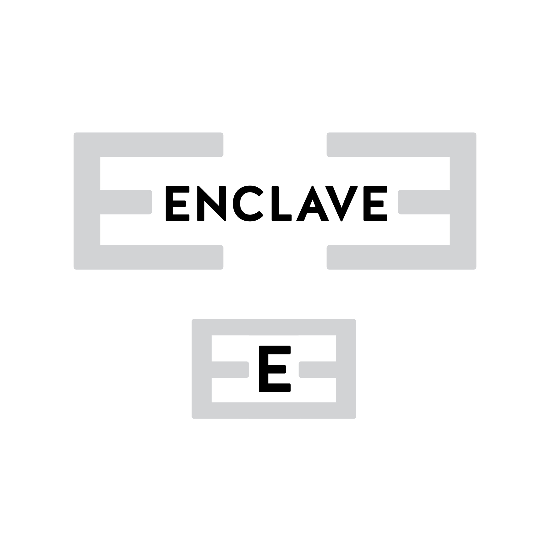
The design of a logo has its own personality. In this typographic exploration for the company Enclave, I created a series of logos that featured corporate, modern, personal, and traditional designs.

The client selected a corporate logo featuring a modern typeface, Halis, with graphic elements created using the typographic structure of the letter "E." The logo feels corporate, professional and sturdy, to be employed in a government environment. 

Enclave is an international company that brings stability to regions by assisting host nations with counter-terrorist efforts, economic development, and humanitarian assistance and relief.


Yellow Leaf Woodworks

Occasionally, clients know exactly what they want. In this case, the owner of Yellow Leaf Woodworks knew just what he wanted his logo to look like (sketch below), even down to the typeface. His request was for some "professional spiffing." Using his sketch, I created a series of logos for him to choose from, staying true to the original architecture he requested. 


Original Request from Client


Final Logo Designs


Additional Design Options

Gazebo Intimates Logo Design

Gazebo Intimates is a small business located in Northampton, Massachusetts. The brick & mortar store has been in the same location since it first opened in 1978. Historically, the logo has appeared in many styles and colors, with little consistency. The owners wanted to keep the original script feel of the type, but update it to a modern, fresh look. Most importantly, they wanted their brand to feel cohesive across multiple platforms, such as print, web and social media.

We choose a soft, feminine color palette that was versatile and functioned interchangeably. After exploring many typefaces, the logo was set in Winsome Basic (gazebo) and Lato (intimates). 


Happy Monday! PINE Award of Excellence

I had a wonderful surprise on Monday when I was notified that I won a PINE (Printing Industries of New England) Award of Excellence. The winning design was a sweet little menu for the Chelsea Royal Diner (which has the best food). Thank you Springfield Printing for the submission!


O'Neal School Party Invitation

This is a fun little invitation I created for neighbor (in trade for a bottle of wine). It feels good to break my brain out of my normal design routine for a chalkboard look and feel.


Interiors by Whitney

Whitney Nilsen, a Realtor, wanted to expand her business by starting an interior design company. When talking about her logo, she wanted something "fresh, youthful, professional, and colorful." The beauty of this logo is that it can change color as needed while maintaining its integrity. 


Oh Albert.

Loving this quote!


Organic India Packaging Exploration

Organic India, a holistic tea company focused on changing the face of agriculture in northern India, requested a packaging update to better reflect their brand and values. After discussing the company’s mission and differentiators (certified organic, non-gmo, biodynamic farming, humanitarian support, etc.), I created two designs that highlighted not only the ingredients, but also the powerful story of their farmers. Authenticity played a key role, as the imagery of the farmers and the Tulsi were both shot on site at Brindavan Farm in India.

Two packaging design options shown.


Organic India Tradeshow Booth

One of my favorite projects from this past year is the Organic India Tradeshow Booth. For the theme of the booth, we chose to use an authentic Indian wedding tent as our muse. The tent was handmade in India by Raj Tent Company, each piece individually crafted. We chose every detail, down to the color of the piping on the pole sleeves. The goal was to create a booth that was branded and functional, but also stayed true to the traditional characteristics of an Indian wedding tent. 


I worked with Organic India to develop a color scheme that represented the vibrancy of the ingredients used in their natural, organic teas (which you should try, because they're wonderful). The color of each piece of fabric, tassels and ink used to construct the tent was derived from the color palette. The pattern on the ceiling was designed to showcase the Organic India logo and hand-pressed by Indian craftsmen before being delivered to the United States. We also created photographic wallpaper featuring the farmers and ingredients to convey the brand story. 

Mood Boards

 
OI-MoodBoard_Booth_v2-1.jpg

OI-MoodBoard_Booth_v2-2.jpg

Colored Rendering


Photographic Wallpaper


Completed Booth

Archaeology Class!

I am fortunate to have a wonderful neighbor named Angela. She also happens to be a real-life, bonafide, Archaeologist. She is currently teaching and asked me to create a small flier for her upcoming class in the Sandhills. I enjoyed playing with color and imagery in this fun little project. Extra perk: I can now spell Archaeology correctly.