Vintage Hangout Logo Creation

Vintage Hangout helps their customers find the vintage that speaks to them, where ever they are. They requested a logo that spoke to their vintage roots with a fresh look. 

Vintage is set in Abraham Lincoln, a “tall, skinny & honest” typeface inspired by the advertisements and playbills of the 1800s. Hangout is set in the modern sans-serif Halis, which means “pure, or clean."

 
Photograph by Julie Balgavy Photography

Photograph by Julie Balgavy Photography

Photograph by Julie Balgavy Photography

Photograph by Julie Balgavy Photography

To see a glimpse of the design process, check out the gallery below. We spent time looking at different typographic styles, architectural elements and color before choosing the final design. 

To learn more about Vintage Hangout, visit their Facebook page, or the Vintage Hangout Website!


Letterpressed Beer Coasters

This year, for my birthday, I received a brand new Boxcar Base! Which, to anyone familiar with letterpress printing, is a very exciting piece of equipment to own. I’ve wanted one for a long time, but hadn’t found the money to make the investment. It’s the perfect match for my Kelsey Excelsior 5 x 8 Letterpress.

What is a Boxcar Base, you ask? Using a Boxcar Base, allows me to work directly from my design files, order polymer plates, mount them to my shiny, new, type-high base and voila! Ready to print!

(To learn more, check out www.boxcarpress.com. Their website is a great resource.)

I wanted to repay my wonderful boyfriend for his gift, so naturally, I decided to make him beer coasters. I used the typeface Core Circus, designed by the foundry S-Core. I wanted to start with a relatively simple design, because I had never worked with a Boxcar Base before. I ordered by polymer plates and found the whole process incredibly easy. 

Check out the final product! My next challenge is to use color to add a second layer to the coasters. Core Circus is a typeface specifically designed to be layered over itself. More to come!


Botanical Printmaking Workshop

Botanical Printmaking Workshop // Sandhills Horticultural Gardens

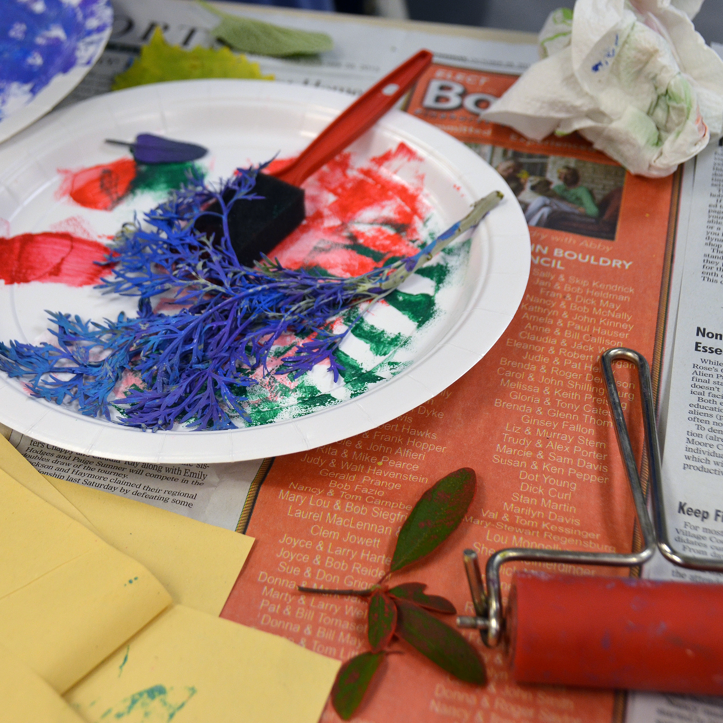
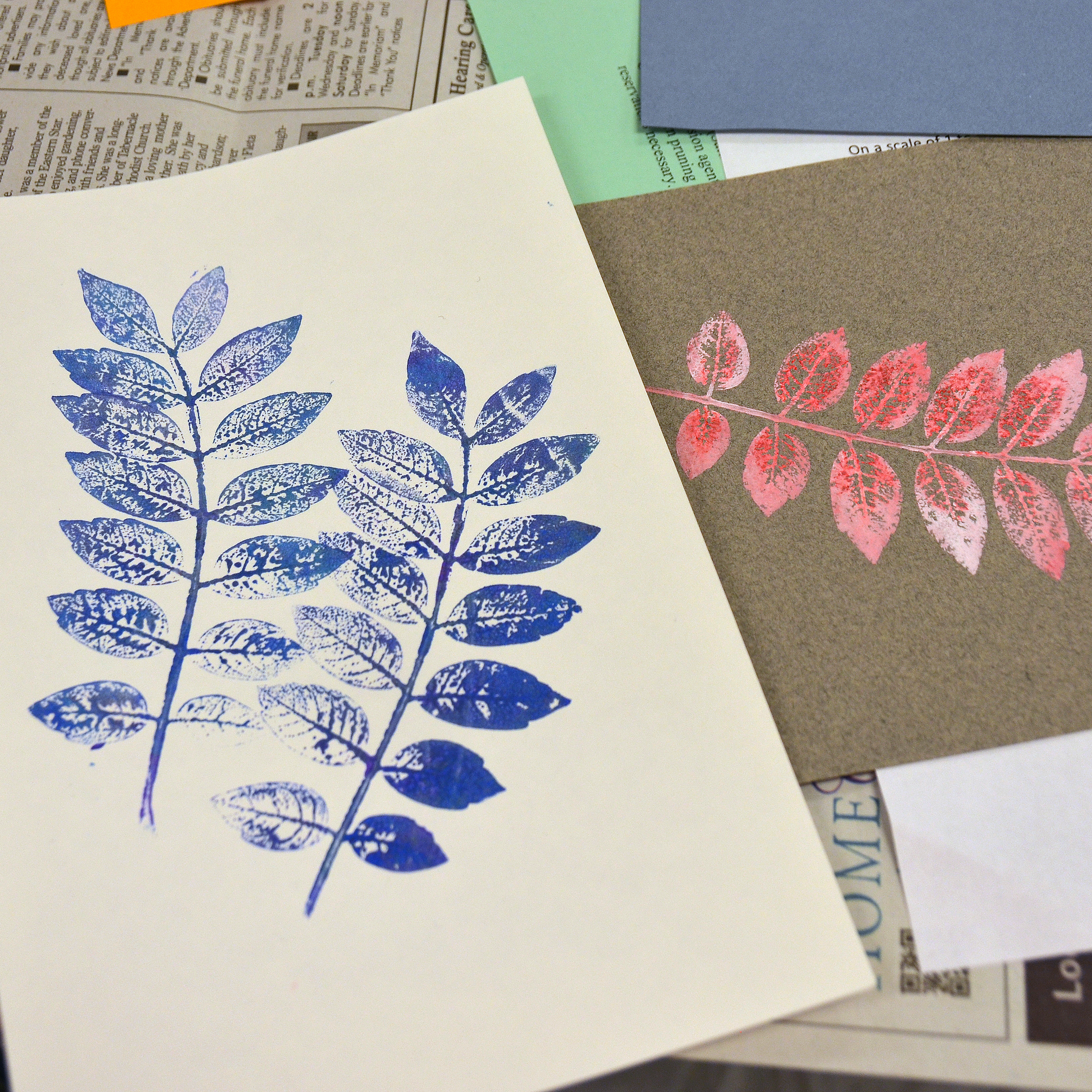
I enjoy teaching, especially to groups that have very little experience with printmaking, or with art in general. Creating botanical prints is a very easy, fun, rewarding practice that allows to students to learn about color, texture, shape and layout. Without realizing it, they dive head-first into the creative process. The materials include paint, brayers, foam brushes, plant material gathered from trees, vines, weeds, etc, and paper. 

One of my favorite aspects of the workshop is listening to the conversations, exclamations, and surprises the students have. “That’s so pretty! I can’t believe I made that. I want to do more!” or “The texture on this leaf is so detailed! It looks like tiny, little streets.” Students are interested in what others are making. They begin to build a community, sharing ideas, looking at each other’s work, helping each other to overcome challenges. 

The last workshop I taught was at the Sandhills Horticultural Gardens. (If you haven't visited the gardens, you should). I had a wonderful group of students that embraced the process and created vibrant, lovely prints. I heard over and over again, “I can’t wait to do this at home! The kids will love this. Where can I purchase the supplies?” Teaching one generation a way to connect to their artistic side had a wonderful effect—they will now go home and teach a new generation. How great is that?

http://sandhillshorticulturalgardens.com


New Chapter Website Exploration

Creative Services was charged with developing a new look for the New Chapter website, researching user interface, promoting company culture, as well as the authenticity of the product. The department split into multiple teams to pitch ideas ranging from a complete redesign, to a minor revamp. The designs created will be used to inform the direction of the 2015 website update.


Chelsea Royal Diner Menu Set

The Chelsea Royal Diner is locally owned, serving Brattleboro since 1939. Over the years, as the menu had grown and changed, the owners found themselves in desperate need of an update. They asked for bright, fun, retro, and most of all, readable. Offering the original Royal Diner sign as inspiration, the new menu tied an important historical artifact with a fresh design.